Welcome, Guest |
TOPIC:
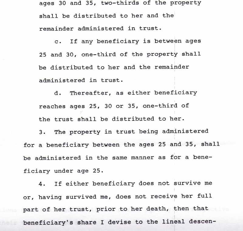
Need help to determin type and age of this font. 11 years 11 months ago #406
| |
Please Log in or Create an account to join the conversation. Last edit: by russelcampbell. |
Re: Need help to determin type and age of this font. 11 years 11 months ago #407
| If you are investigating the originality of the document and the actual date this is produced, I have to say this is not an easy or straight forward task. The space between the lines, the monospace font used (each letter takes equal space vs the modern proportional kerning fonts) and the justification of left/right margin, all indicate that this document have been produced by an (electric) typewriter or equivalent equipment. Today there are modern digital fonts that mimic the fonts of this era. For example there is a font called Pseudo APL which is very close to your document (and there may be also others): www.findmyfont.com/index.php/fonts/font-preview?fset=Dafont-2&ffam=Pseudo%20APL%20-%20Regular&fid=b7dd4b365849d13ec4032fc2bc384639&fsize=36&text=ages%2030%20and%2035%2C%20two-thirds%20of%20the%20property%20shall%20be%20distributed%20in%20to%20her%20and%20the%20remainder%20administered%20in%20trust.&wrap=2 Note that the comma /,/ and the /i/'s dot doesn't match very well to your document. The "Pseudo APL" implies that the font mimics the APL typeball print head which was first used in the IBM 2741 printing computer terminal, introduced in 1965: en.wikipedia.org/wiki/IBM_2741 ...and I suppose it was used and improved on the next years. Therefore the font-style, line-spacing, page justification looks consistent with a document produced 40 years (or less) ago. If you want to be sure that the document is not faked, or at least to be sure it's actually produced by a typewriter device and not created digitally latter, I suggest to do a high scan resolution (1200 dpi or more) and to compare the letters (i.e. all /a's, all /e's etc): Each typeball print head (and also any typewriter with constant printing elements) has small imperfections which will show up on the large magnification of a high-res scan. I hope that helps a bit. Fivos Vilanakis - Softonium Developments CTO The following user(s) said Thank You: harris |
Please Log in or Create an account to join the conversation. Fivos Vilanakis - Softonium Developments CTO Last edit: by fivos. |
Time to create page: 0.296 seconds
