Welcome, Guest |
TOPIC:
Why Didn't It Find This One? 14 years 3 months ago #101
| |
Please Log in or Create an account to join the conversation. Last edit: by DickPape. |
Re: Why Didn't It Find This One? 14 years 3 months ago #102
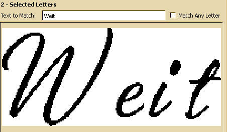
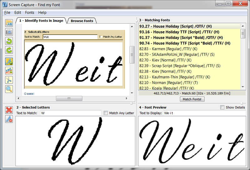
| Hi Dick, When you have an image containing a script font, it's not always easy to tell what's the best point to cut the letters (i.e. to place the separators). If there is a not-connected letter, it's almost always better to first try with this one. If you look at the screen-capture bellow you could notice 2 things: a) A selection of the first (not-connected) letter /W is enough to successfully identify the typeface: House Holiday Script b) The rest letters "eit" are actually much wider than your original selection, and that's the reason you didn't find a match As a general rule: There is no reason to select many letters, just select 1-3 distinct letters. Fivos Vilanakis - Softonium Developments CTO |
Please Log in or Create an account to join the conversation. Fivos Vilanakis - Softonium Developments CTO Last edit: by fivos. |
Re: Why Didn't It Find This One? 14 years 3 months ago #104
| Yup found it in 1. Thanks, Dick |
Please Log in or Create an account to join the conversation. |
Time to create page: 0.268 seconds


